Our Solutions for You
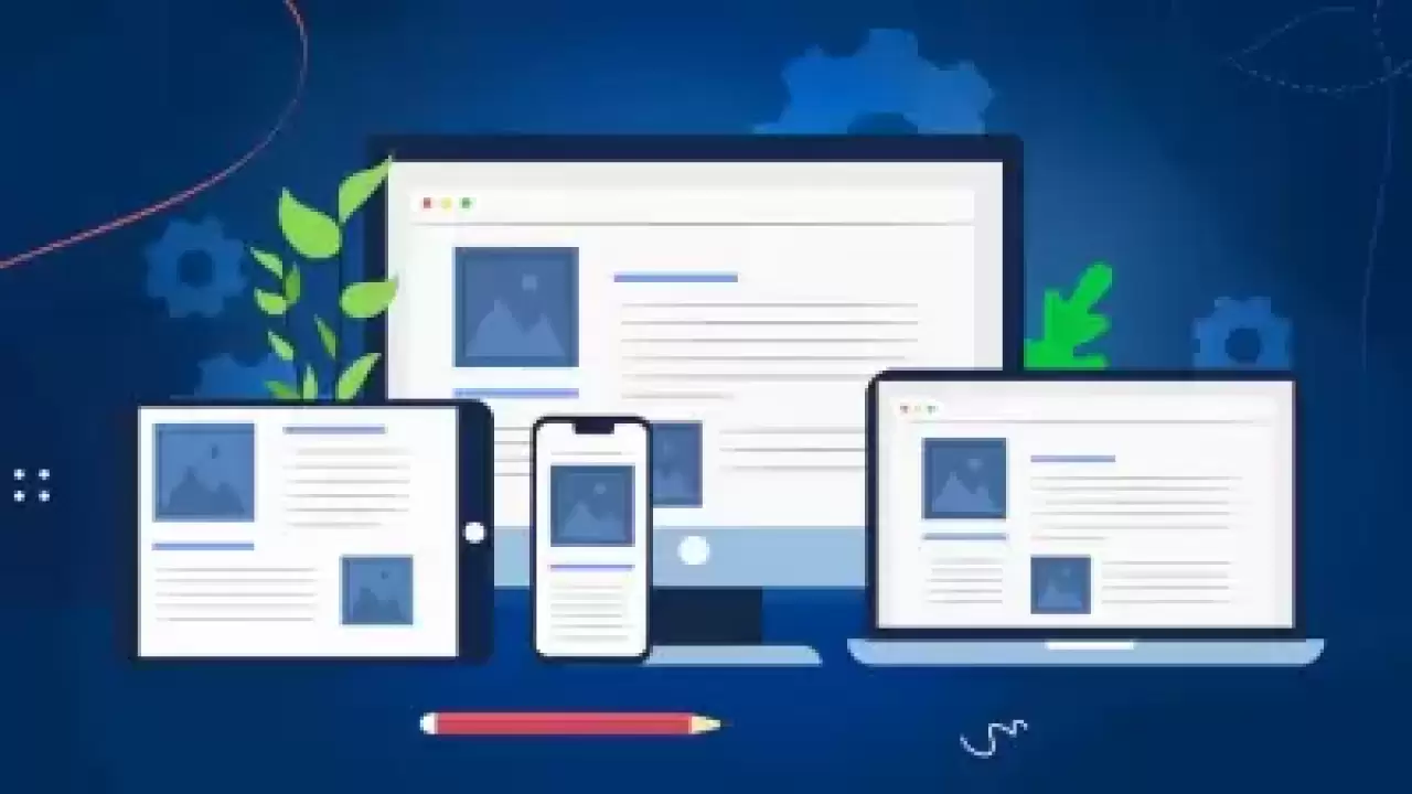
Web Design
Web Design for Modern Digital SolutionsWhat is Web Design for Modern Digital Solutions?Web design for modern digital solutions involves the strategic creation and development of various digital platforms, such as corporate portals, sophisticated e-commerce sites, responsive mobile applications, and other specialized web-based applications. This process incorporates a blend of visual aesthetics, user-centric design, functionality, technical prowess, and efficient content management. The objective is to facilitate a seamless and engaging user experience, enabling users to navigate, interact, and achieve their objec...
Read More
Software
Online Tourism Partner offers comprehensive and innovative software services for the tourism and hospitality industry. These services are designed to meet the needs of hotel businesses and travel agencies and contribute greatly to the digitalisation process of the sector.Hotel Software ServicesHotel & Contract Identification: Defining and managing hotels and related contracts in the system in detail.Agency Loyalty Programme: Encouraging repeat business by increasing the loyalty of agencies.Customer Loyalty Programme: Programmes that increase the loyalty of customers to hotels.Hotel CRM & Call Centre: Cust...
Read More
-
E-Commerce
- Tourvisio / Paximum API Integration
- Customised E-Commerce Software Services
-
Booking Engine
-
Agency Loyalty Programme
-
Tour Software
-
Transfer Software
-
Car Rental Software
-
Golf Software
-
Hotel & Contract Identification
-
CRM - Call Centre
-
Customer Loyalty Programme
-
GDPR & Integration (Cookie Management)
Internet Advertising
Online Advertising Strategies and PlatformsOnline advertising is an essential tool for promoting products, services, or brands on digital platforms. These advertisements are typically displayed across various online venues, including websites, search engine results pages, social media platforms, and other digital environments.Online ads can be presented in diverse formats and styles, each with unique characteristics. Here are some common types of online advertising:Display Banner Ads:These are visual-based advertisements found in specific areas on websites. Display banners come in various sizes and designs to gra...
Read More
Seo Service
Strategic SEO Approaches for Corporate BusinessesSEO, or Search Engine Optimization, is a vital digital marketing strategy focused on enhancing a website's visibility and ranking in search engine results. The primary aim of SEO is to secure higher rankings in organic search results, thereby increasing website traffic, potential customer engagement, and business growth opportunities.In the context of corporate businesses, Corporate SEO services offer a tailored approach to cater to the unique needs of large-scale enterprises. This specialized SEO strategy is designed to optimize the extensive websites of corporate...
Read More
Corporate Hosting
Enterprise-Grade Web Hosting SolutionsWeb hosting is a crucial service that allows websites to be published and accessible on the internet. It involves storing a website's files, including HTML, CSS, images, videos, databases, and more, on a server. These servers enable users to access the website either by typing in its URL or finding it via search engines. A reliable hosting service ensures the secure, efficient, and uninterrupted delivery of these files to users.For large-scale businesses and organizations, enterprise-grade hosting services are essential. These hosting solutions are tailored to meet the higher...
Read More
Distribution Management
Distribution Management Services for the Hospitality IndustryIn the hospitality sector, effective distribution management is crucial for maximizing visibility, driving bookings, and managing inventory across various channels. Our comprehensive Distribution Management services cater to hotels, resorts, and camping sites, ensuring a streamlined and efficient process from setup to operation. Here’s a breakdown of our specialized services:a) Booking Engine Set UpCustomizable Booking Interface: Implementing a user-friendly, branded booking engine on your website.Integration with Payment Gateways: Ensuring secure and...
Read More